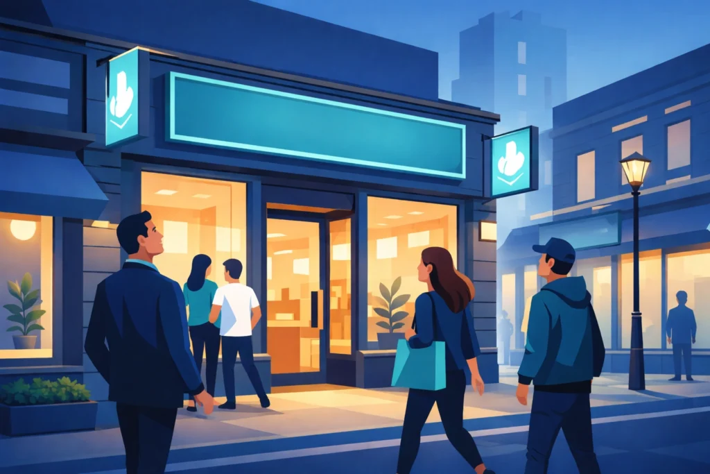
Used in large halls and busy centres, a large-format poster has only a moment to earn a second look. People are walking, talking and checking their phones, so your design must communicate instantly. Clear hierarchy, bold typography and a single strong message help your poster stand out at a glance. High-impact imagery, confident use of colour and generous white space ensure that nothing feels cluttered or hard to read.
When design and print work together, large-format posters achieve something digital media cannot: they occupy real space in your customer’s world and quietly guide how people move, feel and buy. Focus on sharp contrast, readable type sizes, and visuals that hold attention even from a distance. This guide highlights practical ways to create high-impact posters for retail and events, and how Pointmedia can help you turn focused ideas into confident, consistent print.
Begin with purpose, audience and distance
Before you worry about colours or fonts, be clear on what the poster needs to achieve. A window poster that tempts people into a store will be functioning in a very different way to a graphic that helps visitors find your stand at a trade show or explains an offer beside a display.
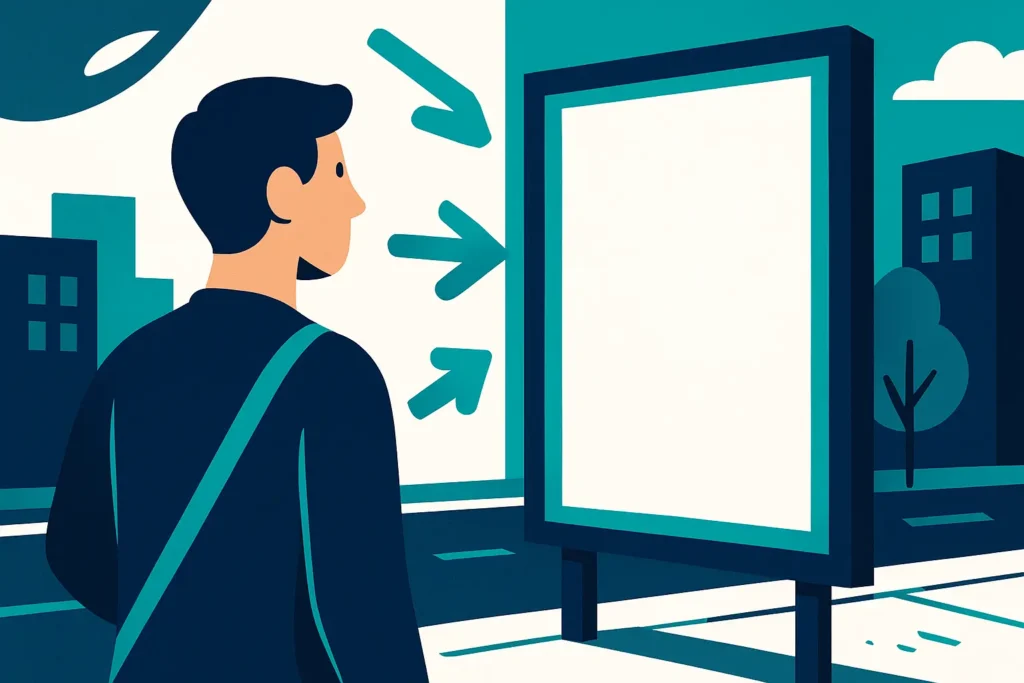
Once you know the job, consider where people will be when they first see it, as viewing distance is one of the most important parts of large format design. The further away someone is, the larger your headline, key image and main call to action need to be. Charts such as the viewing distance and letter height guidance in the Print Handbook are helpful references when you are planning scale.
A simple test is to print a small mock up, affix to a wall and walk away from it. If you cannot read the main message from across a room, your customers are unlikely to manage it in a busy retail or event environment.
Make your hierarchy obvious at a glance
The best large format posters feel simple, even when there is a serious amount of thinking behind them. That sense of simplicity comes from clear visual hierarchy..
A typical structure might start with a bold focal point, perhaps a headline or striking image, followed by a short line that explains what is going on, and then any supporting detail for people who move closer. The principle remains the same as on a website, with usability specialists at the Nielsen Norman Group describing hierarchy as arranging content so people can instantly see what matters most.
To achieve this, resist the urge to say everything on one piece of print. Instead, just focus on one clear idea, expressed with a strong headline and supported by a few carefully chosen details – clean layouts are much more successful in practice than a crowded layout where every element seems to shout at once.

Put legibility first: text size, fonts and contrast
Attractive posters that nobody can read are a waste of budget, and as such, legibility and accessibility always take priority when considering every design decision.
Research into sign design shows that character height and viewing distance are directly linked. For people to read a headline from several metres away, you simply need larger type, clean font and generous spacing. Guidance on signage typography, such as that discussed by the Sign Research Foundation, consistently points towards simple sans serif faces for main messages and very careful use of decorative fonts.
Colour choices can make or break legibility. Accessibility advice from the UK Government and charities such as the Royal National Institute of Blind People stresses the importance of strong contrast between text and background. Dark text on a light background is often the safest route, and coloured text usually needs to be very dark to remain readable.
If you are unsure, you can run combinations through an online contrast checker. The Yale University Library suggests tools that test colour contrast against WCAG standards, which can quickly reassure you that your design is not excluding people.
Use imagery that survives being scaled up
Images that look fine on a laptop are likely to fall apart once they are enlarged to poster size..
For large format print, many technical guides suggest working with artwork in the region of 150 to 300 DPI, depending on how close people will stand to the finished piece. A poster in a shop window that customers can walk right up to usually benefits from higher resolution than a stage backdrop viewed from across a hall. Resources such as the FESPA wide format guides and advice from print industry bodies are good places to explore recommended specs in more depth.
In practice, start with high resolution original imagery rather than copying files from the web. Supply logos and icons as vector artwork so they stay crisp at any size. If in doubt, ask your printer what resolution they recommend for the final physical dimensions. At Pointmedia, pre press checks will flag obvious issues before anything reaches the press, which gives you time to swap or adjust files.
Design for the real environment, not just the screen
It is easy to fall in love with a design on a backlit monitor in a quiet studio; the real test is how it behaves in the actual space.
In retail, think about whether the poster will sit in a window, on a freestanding unit, next to a till, or high above shoppers’ heads. At events, consider entrances, corridors, stages and sponsor areas, particularly with the consideration that factors such as height, angle, lighting and nearby clutter can all affect which parts of your poster people will see first.
Accessibility posters and templates often encourage designers to avoid spreading content evenly across a page and instead use clear headings, short blocks of text and generous spacing; using that same thinking helps a poster stay readable in a crowded environment.
The finishing choices matter as well. A glossy stock can pick up glare from strong lighting, which might hide parts of the design. Matt and satin finishes are often used to give a calmer, more readable surface in bright surroundings – Pointmedia can talk you through stock and finishing options that fit how and where your posters will be used.
Get artwork print ready with support from Pointmedia
Once your design is approved, it needs to be set up correctly for print so you get the result you are expecting. That usually means artwork in CMYK rather than RGB, suitable bleed and safe areas, fonts embedded and images supplied at the right resolution.
Pointmedia’s team can advise on file preparation, check your artwork and then produce high quality large format posters for retail spaces, offices, campuses and events. If you need help with the creative side, the in-house designers can take your idea or brief and shape it into layouts that work at scale, stay on brand and grab attention for the right reasons.